


Flowers for the People
Nicole came to me with a vision and a tagline. The rest was built from scratch. The goal was moody but warm. Artful, professional, playful. A brand that felt like it belonged in a cool independent shop but was still approachable enough to walk into.
BRANDING & WEB DESIGN

No Logo, No Palette, No Problem
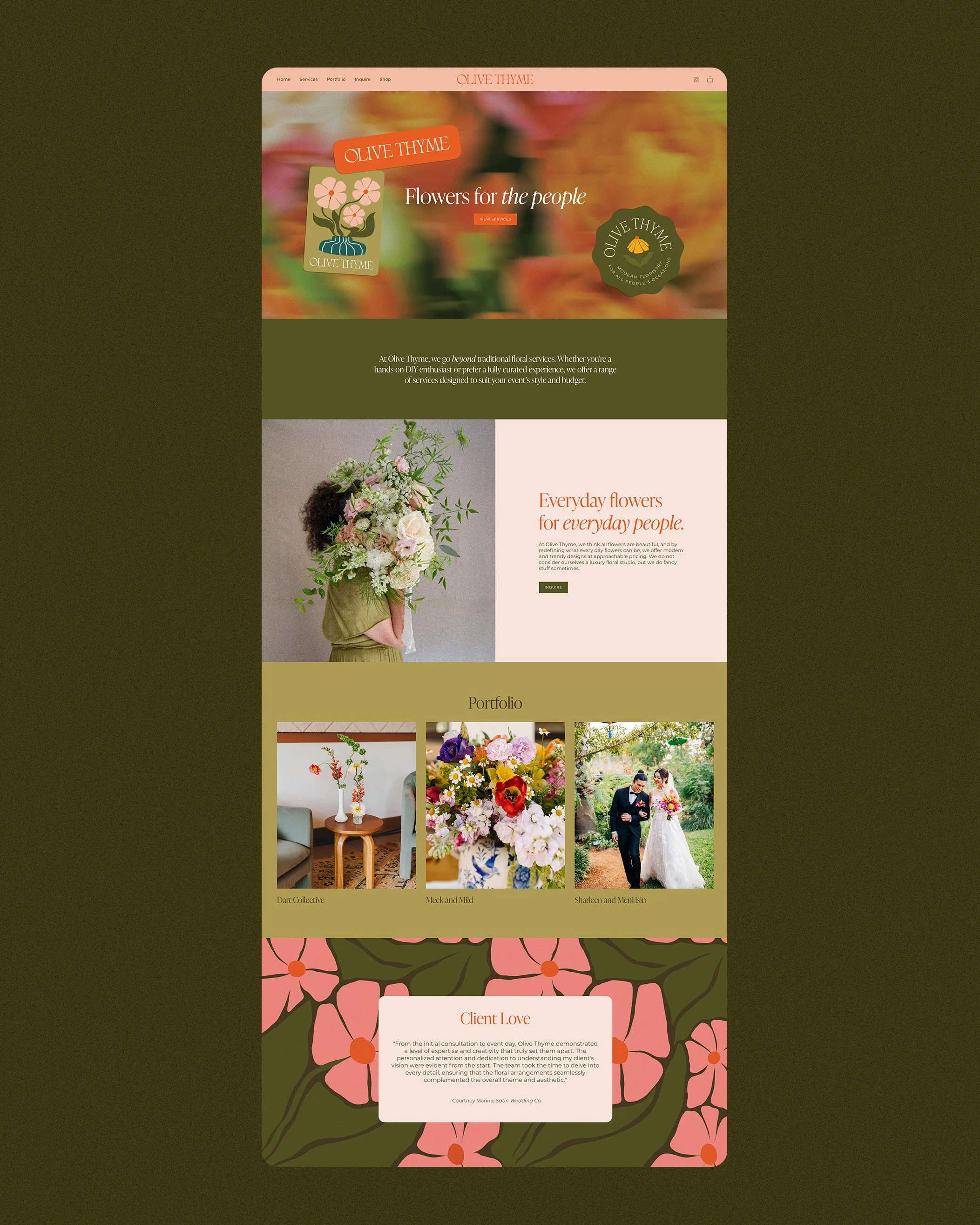
Olive Thyme is an artful San Antonio florist doing weddings and everyday arrangements with a serious eye for design. When Nicole came to me, there was no logo, no palette, no starting point. Just her work and a name. So we built everything around it.
Here's what we built:
Brand identity and visual direction
Custom illustrations and floral patterns
Full collateral suite including business cards, sticker sheets, gift tags, wrapping paper, and matchboxes
Merch design
Website design and build on Shopify

Florals with a Little Funk
Every decision was made to feel like it belonged in her world while still having lots of personality.
The typography leans ethereal and a little vintage — fancy without trying too hard. The colors feel like florals but with some funk to them. And designing patterns for an actual florist is its own kind of pressure — she knows flowers. We went through a few iterations before landing on something she loved.
A serif font that feels tasteful, cool, and a little timeless
A color palette that's bright and floral without feeling generic
Custom illustrations and patterns built specifically for the brand
Multiple logo variations and badge lockups for flexibility across touchpoints


Letting the Brand do the Talking
Nicole didn't have brand photography yet, so we had to build something that could stand on its own without it.
Built on Shopify with her future storefront in mind, the site leans heavily on the brand elements we created — the patterns, the illustrations, the typography — to create an experience that feels full and intentional even without lifestyle imagery.
Built on Shopify to grow into an e-commerce storefront
Patterns and illustrations used throughout to bring warmth and texture
Brand elements did the heavy lifting in place of photography
A foundation she can build on as the brand grows